An ethereal white hue, PANTONE 11-4201 Cloud Dancer serves as a symbol of calming influence in a frenetic society rediscovering the value of measured consideration and quiet reflection.
-Pantone 2026 Color of the Year Press Release1Surely, it's time we asked the question of who gave [Big Colour] the power to decide.
-Stuart Semple2
Introduction: Pay Up or Fade to Black
Adobe users awoke on August 16th, 2022, to an undesirable ultimatum. Due to a licensing dispute between Adobe and Pantone, users now had to pay fifteen to twenty dollars a month and download a separate plug-in called Pantone Connect if they wanted to access Pantone colors in Photoshop, InDesign, or Illustrator. Otherwise, all 15,000 Pantone colors, even in older files, would be replaced with Adobe's default black (Figure 1). To add insult to injury, Adobe Creative Cloud subscription fees, sans Pantone palettes, were increasing, pointing to a growing tendency for companies to offload the cost of previously included services onto consumers. In protest, Stuart Semple, the English prankster artist — who is perhaps best known for his ongoing public feud with internationally renowned sculptor and installation artist Anish Kapoor over the proprietary pigment Vantablack3— posted a video saying he was "utterly raging" and "at the end of my tether with these colour criminals and what they've been up to — it's diabolical."4 In protest, Semple created a free Adobe plugin called Freetone (Figure 2), available for download via his online art supply store, Culture Hustle.5
In 2016, Semple made his Pinkest Pink and Black 2.0 paints available to everyone except Kapoor and required customers to vouch that they were not purchasing the paints on his behalf.6 This time, however, the villains are Adobe and Pantone, and this is reflected in Freetone's accompanying disclaimer: "By downloading the Freetone Palette Pack you confirm that you are not an employee of Adobe or Pantone, nor are you associated with Adobe or Pantone, and to the best of your knowledge information and belief this palette will not make its way into the hands of anyone at Adobe or Pantone." As Semple describes, Freetone consists of "1,280 Liberated colours" that "are extremely Pantoneish," a word which has an endearing imprecision to it. It reminds us that there is no "ish" or in-between in proprietary color standards.7 The striking and sinister image of Pantone swatches rendered monochrome — of color literally disappearing from individual screens overnight — points not just to Pantone's rivalry with existing corporations, but to the reconfiguration of creative usages of color in market terms. Simply put, color has gone private.
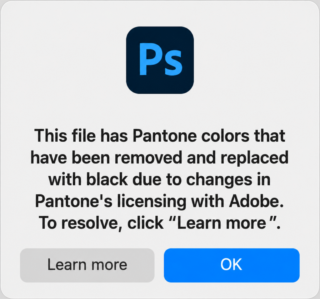
Figure 1: Since August 2022, users who wish to use Pantone colors in Adobe Photoshop must pay a monthly subscription or encounter the above error message.
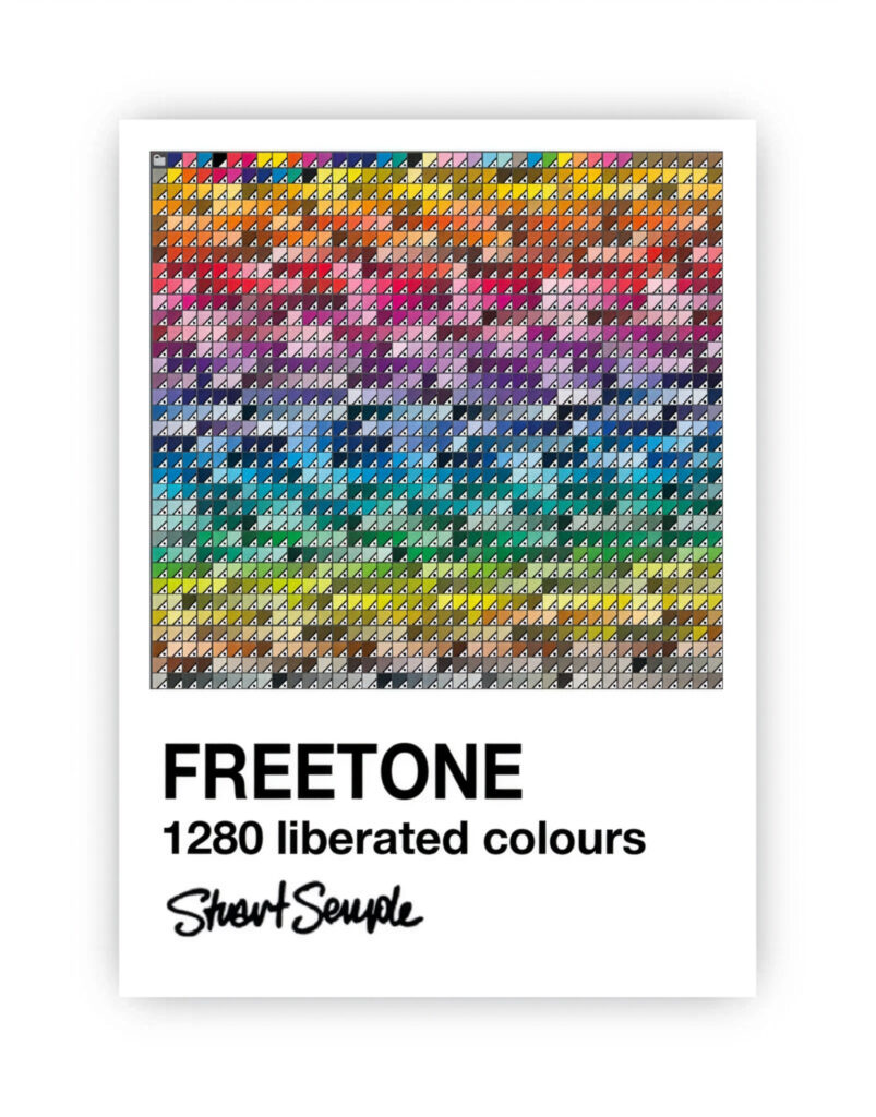
Figure 2: Stuart Semple, "Freetone" (2022). Semple describes Freetone as "1,280 Liberated colours" that "are extremely Pantoneish."
Pantone is, by its own description, the "world's leading color expert" and the "gold standard of color consistency."8 On a basic level, the international color corporation's expertise lies in color management: design parlance for mediating between color systems designed for different technologies or purposes, such as between print, plastics, textiles, and screen displays. Over the past two decades, Pantone has become especially prominent in the public eye through its Color of the Year (hereafter COTY): a shade the Pantone Color Institute (the color forecasting division within the corporation) predicts will be the new "it color" starting in the new year by keeping close tabs on consumer behavior both on and offline.
But Pantone's rationalized approach to color didn't emerge out of nowhere: commercial color systems have existed for over a hundred years, dating back to the late nineteenth century. This moment saw three crucial historical developments which made possible color's transformation into a key instrument of industrial capitalism:
- 1. the synthetic dye industry, which made it possible to mass-produce colors and textures that didn't exist in nature,
- 2. the rise of modern psychophysics, the branch of science which reconfigured subjective sensation as a measurable variable,
- 3. the creation of alphanumeric print-based color labeling systems like the Munsell Color System, whose updated version from 1931 provides the foundation for most electronic and digital displays today.9
Together, these shifts have culminated in our current digital moment, where users typically interact with color in the form of HEX, RGB, or CMYK codes on light-emitting screens, often via proprietary software like Photoshop.
What makes color in the twenty-first century distinct from earlier moments, however, is a key shift from standardization to privatization, where color isn't just regulated by public institutions, but increasingly by a select few corporations with disproportionate market influence, of which Pantone is the ur-example.10 This isn't to say that the notion of having private actors selling color is anything new: Kirsty Sinclair Dootson writes about the "colourmen" who mediated color for artists and the public prior to the nineteenth century in Britain; the paint companies Sherwin-Williams, Benjamin Moore, and Pratt & Lambert (now owned by Sherwin-Williams) were founded over a hundred years ago.11 Still, I would argue that today we are dealing with a different level of soft power and cultural coercion when it comes to branded color. The Pantone Matching System (PMS) is used for everything from military seals to sports teams to branded colors like Tiffany Blue, Barbie Pink, and Coca-Cola Red, and even when creators and companies aren't officially collaborating with Pantone or being paid for their efforts, the corporation has become a stand-in for color in popular visual culture. Instagram accounts like Pantone Smoothies and Tiny PMS Match take the Pantone color swatch as aesthetic inspiration, while a character on a 2019 episode of the popular CW teen drama Riverdale specifies that her favorite color is "Pantone's Flame Scarlet" (which was not, in fact, an actual Pantone color at the time).12 Pantone therefore embodies the increasingly privatized experience of color in the twenty-first century where, as journalist Anne Quito puts it, "The very design of the Pantone chip seems to have seeped into contemporary culture as a visual shortcut — if not a graphic cliché."13
It's also telling that Semple refers to companies like Pantone as "Big Colour," drawing a direct parallel to the Big Data of today's "black box society," a now widely accepted chromatic metaphor of secrecy describing the privatization and obfuscation of once-public information.14 The black box, which originated as an opaque black material device concealing its inner functions, is part of a longer history of computing and cybernetics that long predates Big Data.15 However, especially in the realm of science and technology studies, it has become a potent way of describing the myriad ways in which colorful interfaces conceal their inner workings (and hence the labor involved to produce them) from the user.16
Taking Semple's coinage as a provocation, this article offers an aesthetic and technological critique of Big Color by looking to Pantone's Color of the Year, which each December the corporation predicts will "capture the global zeitgeist" to "express a global mood and an attitude, reflecting collective desire in the form of a single, distinct hue."17 By tracing two interwoven threads — the standardization, privatization, and enumeration of color on the one hand and color's intimate ties to self-expression and mood regulation on the other — I will argue that Pantone historically and politically decontextualizes its colors by relying on vacuous internet buzzwords like "aesthetics" or "vibes."18 My method is grounded in the interdisciplinary field of "color studies," which I put in dialogue with media studies scholarship on algorithmic culture and digital capitalism as well as cultural and political theorists writing on neoliberalism and precarity.19 Ultimately, I will contend that Pantone indirectly profits from precarity by presenting its self-described soothing or pleasing colors as a sufficient response to a world in perpetual crisis. Simultaneously, it normalizes a troubling narrative that the color spectrum itself can be captured and privatized swatch by swatch. This intersection of color and capture necessarily invokes the ever-looming specter of race in the United States, which was built on a skin color-based racial caste system oriented around the two polarities of Black and white. Furthermore, beginning in the nineteenth century, educators, social theorists, and eugenicists relied on standardized color tools like charts, spinning tops, and folding fans to catalogue racial "types," illustrating what Carolyn L. Kane and I have described as color's deeply entrenched double-valence as both race (e.g., a tool of white supremacy) and hue (e.g., a sensory quality of light or pigment).20
I begin with an overview of how color became privatized, looking to twentieth-century developments in copyright law, as well as the rise of neoliberalism and the decline of the welfare state. I then recount how Pantone came to hold such a cultural and financial monopoly over color, from its modest print shop origins to its current privatized Big Color status. The crux of the piece then analyzes the COTY as an internet-specific phenomenon whose virality has coincided with global crises such as the Great Recession and the COVID-19 pandemic. I show how Pantone relies on a set of audiovisual, affective, and linguistic tropes to frame the COTY as a means of attaining self-actualization and serenity while profiting on the very socioeconomic problems it purports to alleviate. In the final section, I turn to parodic artistic interventions and internet memes which pointedly call out the company's empty promises of color as a cure-all for precarity. At the same time, in their ambivalent and often self-defeating tactics, these objects also reveal how critiquing Big Color demands new understandings of political and artistic resistance when older oppositional strategies are no longer viable.
Color Goes Private
As my opening anecdote about the Pantone-Adobe split revealed, our experience of color has become increasingly mediated by private actors. But how do we define privatization when it comes to color, a ubiquitous facet of perception and vehicle of cultural meaning that wouldn't appear to belong to anyone? As the word implies, privatization involves transferring what were previously public entities or services — such as education, health care, water supply, and prisons — into private hands. Scholars of political economy have shown how privatization (alongside outsourcing, deregulation, the end of wealth redistribution, financialization, and reduced welfare) is central to neoliberalism, whose ultimate priority is ensuring free markets and where the state's priorities become indistinguishable from those of the firm.21 As political theorist Wendy Brown argues, neoliberalism is far more than a political ideology or a changing relationship between the economy and the state; it is "an order of normative reason that, when it becomes ascendant, takes shape as a governing rationality extending a specific formulation of economic values, practices, and metrics to every dimension of human life."22
The ramifications here are stark. For decades now, non-economic areas of everyday lived experience have been reframed in monetized terms, from dating to posting on social media to applying for jobs. Neoliberalism mines human beings for capital, mediating and measuring selfhood via rankings, ratings, likes, swipes, and reposts.23 Even sleep, once thought to be late capitalism's last frontier,24 is now a site for corporate extraction, with automated color calibration tools like Apple's "night shift" allowing users to extend their screen engagement well into the night with their phones next to their pillows.25 While it's no secret that public and unownable sensory experiences are now at the hands of the market, color is often left out of the neoliberalism discussion, even when it is a key resource for both literal (physical/chemical) and metaphorical (emotional/personal) extraction. But what legal, scientific, and epistemic shifts made possible color's privatization in the first place?
Sociologist Meredith Hall shows how color's absorption into intellectual property law occurred gradually over the course of the twentieth century, culminating in a 1995 United States Supreme Court decision, Qualitex v. Jacobson Products Co., Inc. The Court upheld dry cleaning company Qualitex's right to trademark its signature shade of green-gold, establishing a legal precedent which made it possible for color's material, numerical, and aesthetic properties to become property.26 While companies like Pantone were only cursorily discussed during the case, the mere existence of standardized technologies capable of representing colors as numerical information was sufficient evidence that individual colors could be trademarked in a quantitatively "objective" way.27 Moreover, Qualitex v. Jacobson overturned the "mere color rule," which had held that single colors were not distinctive enough to be trademarked. The case did so by granting registration to colors with sufficient "secondary meaning" — in this case, green-gold as inseparable from Qualitex's brand identity. Because trademarked color could supposedly benefit the consumer by making it more efficient to recognize and choose a product, the act of trademarking individual colors could now be framed as "just, apolitical, and perhaps even a natural consequence of corporate creativity."28 In summary, while it remains far from evident what it means to own a color or whether it is primarily producers or consumers who create meaning, the overall trend in the past three decades has been towards the privatization of things thought previously unownable. And while it's not possible (yet!) to copyright colors, as opposed to trademarking them, corporations can patent specific ink formulas or copyright a database like the PMS and its digitized versions.
While Pantone has since emerged as a key player in the commercialization and privatization of color, its hegemony wasn't inevitable. Rather, its ubiquity stems from the corporation's early adoption of computer color to the viral logics of social media and online culture and, ipso facto, its reliance on a now familiar digital model of selfhood and subjectivity. This model is characterized by online participation and personalized algorithmic recommendations, where, as John Cheney-Lippold put it nearly a decade ago, "it is our data that is being watched, not our selves."29 Significantly, Pantone also builds on a legacy of behaviorist-informed color marketing strategies dating to the mid-twentieth century — or what today often goes by the name "color psychology." Between the 1940s and 1960s, the rise of mass-produced paint colors, together with the growth of self-help culture and discourses surrounding personality, reconfigured color as a psychological and physiological variable thought capable of influencing or controlling mood or affect. As I've argued elsewhere, color was at the heart of dreams of domestic happiness in the postwar United States, where white, middle-class homeowners aspired to create tranquil and personalized home environments with the aid of standardized, numerically labeled color charts.30
In the twenty-first century, this institutionalized correlation between color and affect has only strengthened with the shift from standardization from privatization. Effortlessly fusing popular psychology and consumerism, constant access to the internet makes it possible to shop, browse, and socialize twenty-four hours a day, turning what had once been associated with privacy — leisure time, personality, mood — into surveillable economic entities. At the same time, the domestic ideals of the postwar period have become pipe dreams achievable only for a select privileged few. Against the background of what critics have alternately described as 24/7 capitalism (Crary), platform capitalism (Srnicek), or too late capitalism (Kornbluh), Big Color, as we will see, is emblematic of neoliberalism's large-scale abandonment of care, where the onus is increasingly on individuals to look after themselves in the absence of institutional support.31 In what follows, I provide a brief history of Pantone and trace how its early adaptation of digital tools and corporate partnerships allowed it to obtain such a monopoly over color and become the social media empire it is today.
From Local Print Shop to Big Color
The first iteration of the PMS, in 1963, had a mere ten colors, all of which were meant for print. The idea behind the system was to provide designers a standard with which to match color from the design to production stages. Over the span of six decades, this number has ballooned to upwards of 5000, with the company adding new swatches each year geared towards a wide range of technologies and materials. Of these 5000-plus colors, 2,161 are "spot colors" —proprietary inks mixed from Pantone's eighteen base colors according to a patented formula. The remaining colors are "process colors" keyed to four-color print processes like CMYK.32 Spot colors are what make up the Pantone Guides, or fan decks of six-by-two-inch cardboard sheets, each of which is printed on one side with a row of color swatches organized from light to dark (Figure 3a).
Notably, the Color Guides (according to Pantone, at least) only have about a twelve-to-eighteen-month lifespan, since the swatches fade over time and new colors are added each year (Figure 3b).33 However, when the company releases "new" colors each year, they are not, as their marketing language might suggest, synthesizing novel materials (such as Vantablack) or inventing never-before-seen shades (as scientists at UC Berkeley claimed in 2025 to have done with "olo," a blue-green hue which can only be perceived with the aid of lasers).34 What Pantone is doing is finding new ways to subdivide the visible spectrum into discrete units that can then be subsumed into its ever-expanding library. It may not be possible to own color itself, but corporations can copyright how we organize and notate it. Time and again, Pantone naturalizes the myth that the spectrum itself is something that can be privately owned or captured swatch by swatch — a myth made glaringly clear by a somewhat self-indulgently titled book co-written by founder and CEO Lawrence Herbert titled The King of Color: The Story of Pantone and the Man Who Captured the Rainbow (2007)and a 2025 documentary simply titled The King of Color.35
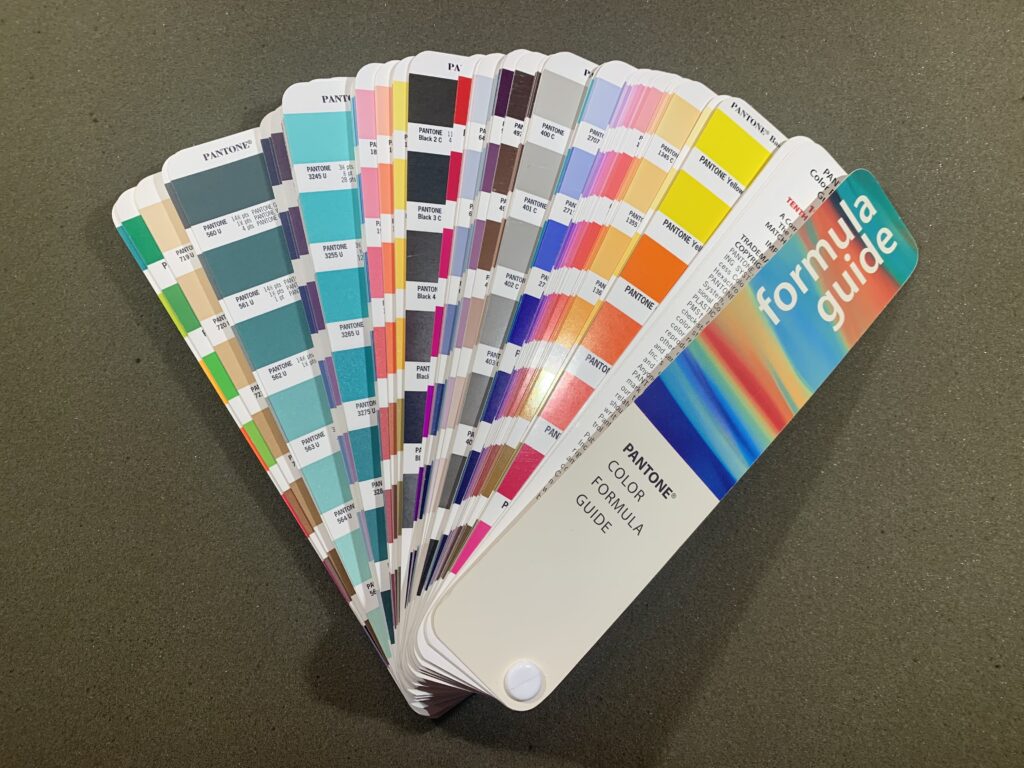
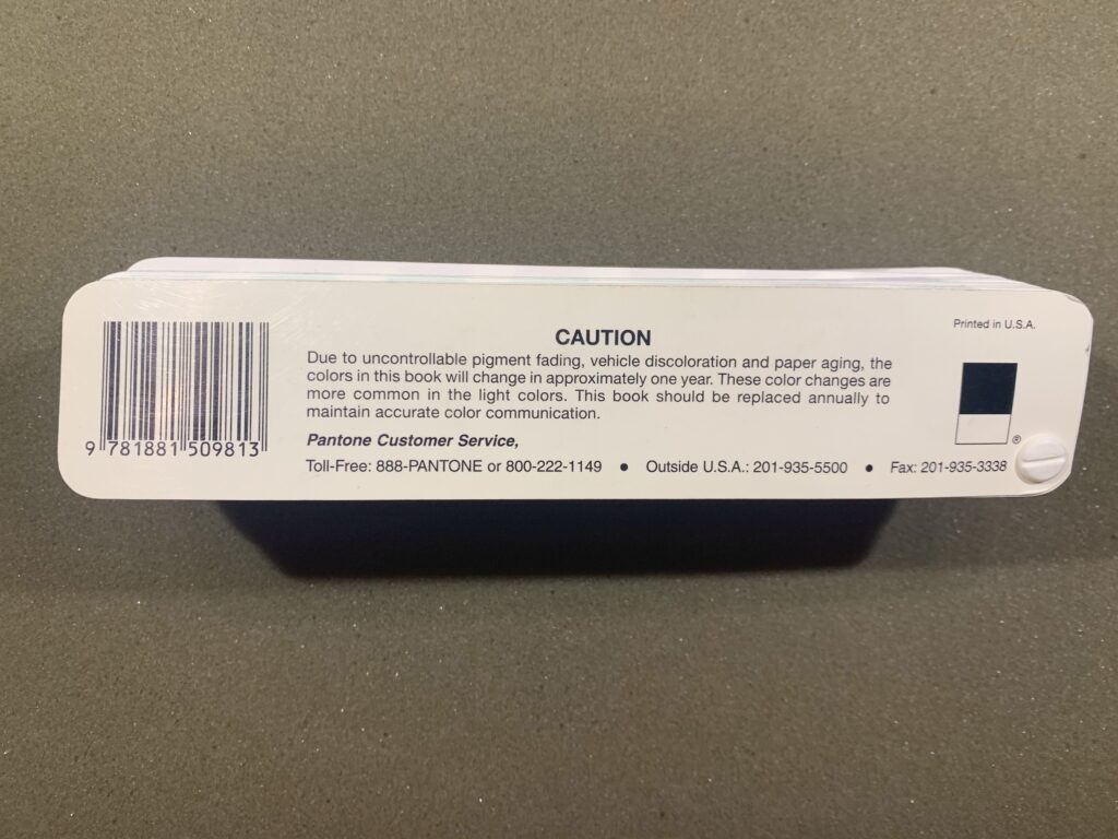
Figure 3a-b: Sample Pantone formula guide from 1997 (10th printing). Photos by the author, taken at Cooper Hewitt Research Library.
But let's backtrack. In 1956, Herbert, a graduate of Hofstra University with a chemistry background, began working part-time in the printing division of M & J Levine Advertising, a small New Jersey-based company specializing in cosmetics matching cards. It was precisely this moment, described by some business historians as "the color revolution," when consumers began seeking more precise standards for matching and customizing color, resulting in widespread demand for professional color consultants.36 In this sense, Herbert was in the right place at the right time. Observing that there were no industry-wide standards for color printing, he put his medical school aspirations on hold. In 1962, he purchased M & J Levine and renamed it "Pantone" (a portmanteau of the Greek "pan" and the English "tone," meaning "all colors") and under his direction, the company developed the PMS the following year. In 1977, Herbert took the company private. What happened next is typical of corporate capitalism's diffusion of power: In 2007, Pantone was sold for 180 million dollars to X-Rite, a manufacturer of color measurement tools that also owns the Munsell Color System. Five years later, X-Rite was itself acquired by global science and technology conglomerate Danaher Corporation for 625 million dollars. The narrative, then, becomes not just about who owns the color standard, but who owns the owner of the owner of the color standard.
Significantly, Pantone was one of the first U.S. color-focused companies to reconfigure its mission for an increasingly digital world. It strengthened its cultural cachet not merely by continuously expanding its color palettes and developing new standardized technologies, but through a cascade of corporate partnerships and licensing agreements. Crucially, this strategy long preceded the rise of personal computing, Web 2.0, and the increasing ubiquity of digital color printing in the late 1990s and early 2000s. As early as 1974, the company created a Color Data System for computerized inkjet printing, and ten years later established an Electronic Color Systems Division. During the mid to late 1980s, Pantone also entered a series of licensing agreements with major graphic design software manufacturers who then adapted the PMS for both IBM-PC and Apple-Macintosh platforms. In 1990, Pantone further amped up its commitment to digital color, creating an electronic toolkit designed to optimize its colors in Pantone-licensed printers and even sponsoring a symposium at Cooper Hewitt called The Dynamics of Color which included a demo titled "The Future in Color in Computer Graphics" led by former Apple creative director Clement Mok.37
In subsequent decades, the corporation's aggressive investment in social media marketing and data analytics proved even more lucrative, as it began to sell color as not just a digital or print-based tool but as a cultural and emotional commodity. Today, Pantone's official Instagram account has more than four million followers, and the hashtags #pantone and #pantonecoloroftheyear regularly peak immediately after the corporation announces the Color of the Year. PR platforms encourage brands to take advantage of the COTY's media buzz by implementing the following strategies, even if they don't know yet what color will be chosen or have no official business relationship with Pantone:
- Follow Pantone on social media, especially Instagram, with notifications turned on
- Update image keywords for relevant products to include the new COTY name and related terms so they come up on search engines
- Craft a press release showcasing products in the new COTY
- Use trending hashtags like #pantonecoloroftheyear or #pantoneCOTY to get more social media exposure and keep up with other accounts using these tags
- Highlight products which complement the color by referencing the supplemental color palettes Pantone releases that are meant to harmonize with the COTY.38
Essentially, these tips are about how to "game the algorithm." They indicate that proximity to Pantone, especially via the COTY, is highly valuable for brands in today's attention economy as a way of getting "eyeballs" on their content. Drawing attention to one's personal Instagram or TikTok page by tagging the COTY might be a form of social currency, directing more views and likes to a user's page, but it also allows Pantone to directly benefit from one's unpaid "engagement." Like most brands with a large online presence, Pantone relies on an imagined (often implicitly female) "empowered consumer" who comments, likes, reposts, and creates new content 24/7.39 In this way, Pantone exemplifies what many have described as the compulsory performance of self under neoliberalism, where labor is blurred with leisure and "authenticity" and "being yourself" are less encouraging suggestions than they are prerequisites for economic success and visibility.40
Even though the attention economy/social branding discourse may seem old hat at this point, it is nevertheless still succeeding for Pantone. This isn't just due to the company's strong social media presence and interactive promotional content, but how it goes so far as to encourage consumers to view their surroundings in terms of Pantone shades. Shortly after Pantone announced the 2020 COTY, Classic Blue (19-4052), the UK-based Rose Cottage Floristry tweeted a photo of the sky at dusk with the following caption: "Pantone Colour of the Year 2020 captured in photo I took at Weymouth has inspired me. You will see how soon. Are you feeling the blue tones this year?"41 Using the #pantone2020 hashtag thus makes it possible to filter one's lived experiences of color into alphanumerically labeled swatches, in turn generating free social media traffic for Pantone. When viewed through Pantone's regimented gaze, a sunset is no longer an ephemeral and ever-changing set of hues owing to the scattering of light by particles in the air, but a measurable unit to be captured and patented. The neoliberal branding of color and its allegedly soothing effects have burrowed into consciousness itself.
The Precarious Aesthetics of the Color of the Year
Pantone's turn to color forecasting thus emerges from a particular moment in internet history. The trend forecasting-focused Pantone Color Institute was founded in 1986, precisely as the company's shift to digital technology was gaining momentum. And although color forecasting long precedes the internet, in the past two decades, social media has become key to fulfilling a self-fulfilling prophecy where influential companies like Pantone draw on already existing color trends to generate cultural and financial capital, thus creating new trends.42 But nowhere is this feedback loop more apparent than with the COTY. Each December, the Pantone Color Institute puts forth a statement introducing a newly named shade they believe most reflects the coming zeitgeist. The announcement, most recently for 2026's Cloud Dancer (11-4201) — "a lofty white that serves as a symbol of calming influence in a society rediscovering the value of quiet reflection"— is the culmination of a year-long process of combing various cultural and social spheres for the most popular colors.43
While this bland and affect-driven rhetoric has become somewhat of Pantone's trademark, Cloud Dancer proved particularly controversial because it coincided with the mainstreaming of white nationalism in the U.S. under the second Trump administration. Spokespeople for Pantone insisted that Cloud Dancer had nothing to do with race, thereby sidestepping any meaningful political critique even as Cloud Dancer's accompanying rhetoric of "cleanliness" and "lightness" invoked the fraught relationship between color, race, and eugenics, and especially between aestheticized and racialized whiteness.44 Pantone likewise maintained that its 2025 COTY pick, Mocha Mousse (13-1023), had no connection to race (unlike the Pantone SkinTone Guide, whose colors only have alphanumeric names), despite an age-old trope of racializing and exoticizing Black people through chocolate and coffee skin tone descriptors. In both instances, Pantone attempts to evacuate its chosen colors of political and historical meaning by fusing the rhetoric of self-help culture with an accompanying ambient soundtrack and visuals, particularly when it comes to the slippage between color as both race and hue.45
For instance, accompanying the Mocha Mousse press release was a forty-three-second promotional video featuring undulating mocha latte swirls. Alternating between glossy waves, tendrils of smoke, and soft fabric, these abstract shapes spell out involuntary emissions of pleasure like "ooo," "ahh," "mmm," and "yum" until the official Pantone swatch number appears at the very end (Figure 4). The soundtrack layers the kind of simultaneously tranquilizing, yet unsettling New Age music one might encounter in a yoga studio or spa (synthesizer, gong, rain-pattering) on top of bubbling, splashing sounds recalling hot coffee being poured. The overall effect is reminiscent of an ASMR, or autonomous sensory meridian response, video, a "content agnostic" media form whose defining feature is not its subject matter, but its psychosomatic effect (in the case of ASMR, triggering a tingling sensation of low-grade euphoria).46 It's not surprising that the video was likely created with the assistance of generative AI, given Pantone's history of jumping on the bandwagon of buzzworthy new technologies.47 The company faced backlash around its alleged use of AI, alongside a sense of general malaise and cynicism that the color looked more fecal than coffee-like. Pantone's opportunism has thus become part of its branded performance of self: always of the moment, up to date, and forward-looking, however vapid or easily critiqued.
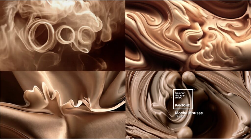
Figure 4: Screen grabs from the official promotional video for the 2025 Color of the Year, Mocha Mousse.
Far from just being a matching tool for design professionals, then, Pantone sells the COTY as an emotional and spiritual salve, removed from any sociopolitical context, that allows consumers to turn inward rather than focusing on the precarious outside world. Laurie Pressman, Pantone Color Institute Vice-President, told USA Today that the "overriding theme" for Mocha Mousse was "this whole idea of harmony. We have enough going on outside of us. We're looking for things that are softer and things that are lighter."48 In this way, the COTY is an example of what Laurie Ouellette calls precarity media: technologies and platforms, like real estate marketplace Zillow or crowd-funding apps like Kickstarter and GoFundMe, which normalize precarity while simultaneously repositioning socioeconomic insecurity and crisis as individualized rather than systemic problems.49 While the COTY, unlike Zillow or Kickstarter, isn't explicitly about financialization, I would argue that it nevertheless indexes precarity by selling color as an emotional commodity designed for an unstable socio-political landscape. Perhaps paradoxically, it does so by willfully divorcing color from the socio-political, indulging an escapist fantasy that could only have been borne out of our current late capitalist end times.
Seen through this lens, the COTY is necessarily an internet-specific phenomenon not just because it lends itself to viral marketing and recommendation algorithms, but because of its uniquely twenty-first-century ethos, where corporations often frame digital technology and networked culture as both symptom and cure. The COTY began in 1999 amidst anxieties about Y2K (in 2019, Pressman explicitly made this connection, reflecting: "We were moving into Y2K and wondering: is the world going to fall apart?").50 That year, Pantone announced its first COTY, Cerulean Blue, described as the "color of the millennium," along with the following text:
Lifestyle movements suggest that consumers will be seeking inner peace and spiritual fulfillment in the new millennium. This is a paradoxical time in which we are heading toward an uncertain, yet exciting, future and also looking back, trying to hold on to the security of the past. In this stressful, high-tech era, we will be searching for solace and Cerulean Blue produces the perfect calming effect.51
This inaugural press release presents us with an illuminating window onto the COTY's ideological backdrop. On the one hand, it shows how the concept of lifestyle has been to Pantone's brand since long before the emergence of so-called lifestyle influencers on social media. But what also distinguishes this 1999 press release is Pantone's more ambivalent stance on technology. On the one hand, the language here embraces forward-looking narratives of progress; on the other hand, it betrays desires to return to a nostalgic pre-digital era by invoking the much older idea that colors are mood-inducing (in this case, that blue is calming). Of course, the tension here is that even as Pantone construes color as an escape from the ills of digital capitalism, it necessarily benefits from the very technologies and economic structures it purports to critique. In future years, the company would cease to reflect on its internal contradictions, instead framing color solely as an escape from an always-on digital world characterized by overstimulation and crisis (one ironically characterized by the blue light emitted from one's screens)— all while continuing to mobilize and modify the discourse of color psychology and mood for precarious times.52
How and by whom the COTY is chosen is deliberately opaque, bordering on performatively secretive. In 2012, a Slate journalist described the process as follows: twice a year, in May and November, a committee of ten self-described color experts convenes in an undisclosed European capital.53 Over the course of two days, these color illuminati engage in a series of presentations and debates until they have narrowed two thousand-plus colors down to a single hue. All this happens in a white-walled room so as not to visually clash with the hues being discussed (an assumed equation of whiteness with background that Cloud Dancer has notably overturned). This United Nations-esque setup gives the illusion of diplomacy and cross-cultural literacy: the Slate journalist (who was "under cover," pretending to be an X-Rite representative), observed that Pantone Institute vice president Leatrice Eiseman was the only American at the meeting and described the remaining participants as "pan-European."54 The location and demographic of the COTY meetings thus solidifies the notion that Europe is the center of the design and fashion world despite increasing competition from Asia.55 It also gives the illusion that the COTY selection process is entirely analog — low-tech, even — cut off from the outside world with no reliance on the internet or digital media.
While Pressman has since clarified that there is no longer a singular meeting to decide on the COTY, she remains opaque about the selection process. As she insisted in 2023: "No one on our global team comes to any Pantone Color of the Year discussion with a commercial agenda or inserts their personal preferences. Instead, we each approach our Pantone Color of the Year color selection in a very pure way. As we like to say, 'we love all of our colors equally.'"56 This could hardly be further from the truth. Rather, Pantone is constantly amassing and analyzing a huge amount of consumer data by combing the spheres of arts, culture, politics, technology, music, and more for recurring color trends, as well as keeping tabs on user behaviors on social media platforms to observe any collective correlations between moods or emotions and specific colors. Pantone and its affiliates therefore have a deeply intimate knowledge of its target demographics' digital footprints and decision-making patterns, while users know little to nothing about the black-boxed inner workings of Pantone.
Exhibit A: in 2016, when Pantone for the first time released two colors of the Year blending into a gradient — Rose Quartz (13-1520 TCX), a warmer pale pink, and Serenity (15-3919 TCX), a cooler pale blue — the company referenced the historically feminized associations of pink and pastels, predicting a global "gender blur" across fashion and design.57 Yet the dusty hue known colloquially as "Millennial Pink" had already been floating through the zeitgeist for over a year, culminating in the release of the Rose Gold iPhone 6S, the music video for Drake's Hotline Bling,and Wes Anderson's The Grand Budapest Hotel (all in 2014-2015), among countless other examples.58As Christine Goding-Doty argues, Millennial Pink, also known as "Tumblr Pink," originated on the microblogging platform Tumblr. Tumblr, which saw its heyday in the 2010s, is known for aesthetically-driven youth subcultures like "pale blogs," where primarily white female users circulate color-coded content with tags like #pretty, #pale, and #pastel. In this way, pale blogs were an ideal way for Pantone to monitor trending colors in an easily searchable and quantifiable way, yet the corporation claimed to have "predicted" the popularity of Millennial/Tumblr Pink, now renamed Rose Quartz. Crucially, although Goding-Doty reads the color palettes of pale blogs as inseparable from the discourse of white anxiety (again pointing to the slippage between race and hue), Pantone instead framed Rose Quartz and Serenity as universally "tranquil" and "calming" antidotes to the turmoil of the 2016 U.S. presidential election.59 The romanticized narrative that the COTY simply stems from a meeting of the creative minds of experts (as opposed to these experts relying on analytics based on consumer analytics and choosing what to emphasize or omit) shows the purity of the hermetically sealed white walled room to be a gimmick at best.
If, as literary and cultural theorist Sianne Ngai writes, the gimmick is a uniquely capitalist form which highlights a particular relationship between time, labor, and value, then the COTY is the gimmick par excellence. It fits neatly into all three prongs of Ngai's definition (rendered here in italics):
- 1. The gimmick is simultaneously dynamic and static — 2026's chosen color will be obsolete by 2027 (and indeed, as I write this, people are already making online predictions for 2027's COTY).
- 2. The gimmick is working both too hard and too little — the sheer amount of money and effort that goes into the COTY selection process manifests in a regurgitation of nearly identical themes and wording each year.
- 3. The gimmick relies on technology that is both too old and too new — Pantone shallowly embraces the Metaverse and generative AI while reusing templates that are over twenty years old.
Taken together, these aspects of the COTY expose the inherent temporal contradictions of late capitalism, which thrives equally on both constant change and permanent stasis.60 The COTY, one of the most successful gimmicks of Big Color, is ultimately "a novelty with no consequences beyond its immediately vanishing moment."61
However omnipresent, the COTY is an easy target for mockery. Each year, articles, think pieces, and social media posts disparage the COTY — and by extension, Pantone itself — for being a sham. Recent withering taglines include "Say hello to Viva Magenta, the color no one asked for, coming to a world where no one lives" (The New York Times)62 and "Sad Beige Won" (a Reddit thread linking Mocha Mousse to the social media trend where influencers, mostly millennial parents, adopt minimalist, neutral-toned hues or their homes and/or children's clothing).63 The ire with which Cloud Dancer was received was decidedly more pointed and politicized, to the point that some questioned whether it was actually "rage bait," leading to parodies like "Klantone" and a segment on Late Night with Seth Myers in which comedian Amber Ruffin blasted Cloud Dancer as "the color of every year." But as a quintessential gimmick, the COTY defends itself from true critique because it is only too easy to dismiss. As Ngai writes: "Protected by its own slickness, as a thing whose sheer stupidity cleverly neutralizes the critical feeling it incites, the gimmick defends itself from intellectual curiosity in a way that puts any person seeking to analyze it at a comical disadvantage."64 The gimmick therefore has an intimate relation to comedy, producing satirical and ironic responses in a way that is distinct from other aesthetic judgments like the beautiful or the sublime, with popular journalism being the primary mode of gimmick-detection.65
Beyond these sardonically critical journalistic pieces, a central and compelling response to the COTY has been artistic reappropriation and imitation, often with a darkly nihilistic bent. One could make the case that Semple's entire project, which revolves around skewering alleged "color criminals" like Pantone, Anish Kapoor, and other private entities seeking to monopolize color, is itself a gimmick. Many of the pigments for sale on Semple's Culture Hustle are predictable riffs on the same theme, from "Proud Chancer" ("chancer" being British slang for a scheming opportunist) and "Viva Meh-Genta" to "Pinkie: The Barbiest Pink" and "Tiff Blue." In this way, as Ngai argues, the gimmick can tell us something about how comedy operates, while comedy also brings into relief the gimmick's key features.66 Yet despite his framing of his own work in terms of "liberating" color for "the people," the irony here is that Semple's artistic brand and livelihood depend wholly on corporations like Pantone to exist.
In this sense, we might read Semple's "Robin Hood" tendencies not necessarily as purely virtuous or liberatory, but rather as a form of parasitical resistance, to borrow cultural and media theorist Anna Watkins Fisher's term. As Fisher argues, the older gestures of rebellion and refusal characteristic of avant-garde and leftist movements are no longer suitable for neoliberalism's diffusiveness, where these now idealistic strategies are too easily coopted by corporations, the state, and the art market.67 When the game is rigged and control is no longer easily discernible from resistance, a new generation of artists, many of whom are themselves precariously dependent on these same institutions, find themselves at an impasse.68 One emergent strategy for freelance artists like Semple (who started a GoFundMe in April 2025 after being sued by the Yves Klein Foundation for selling his "Incredibly Kleinish Blue," a riff on International Klein Blue) is to develop a parasitical relation to a host, often through mimicry and parody.69 Understanding Semple's relationship to his self-avowed enemies as a parasite-host relationship, where "if the parasite kills its host, it goes down with it,"70 presents a more nuanced and ethically dubious reading of his attack on "Big Color" (this parasitism manifests most literally in a recent performative development in which Semple had his name legally changed to Anish Kapoor).71 The privatization of color, it seems, can only be contested through projects which target it from within, but whose impact is more symbolic than material — and often unsatisfying. Still, as Fisher notes, these parasitical artworks are meaningful insofar as they "tell us something important about the systems of power in which they operate."72 In the case of Semple's work, this "something" is the way in which artists working with color today (and especially digital color) often have no choice but to engage with Big Color—otherwise they risk losing access to materials or seeming out-of-touch.
"The Real Colour of the Year" is a crowd-sourced project from late 2025 in which Semple asked his social media followers to vote on a color through a custom website ("I've had enough of a secret cabal of colour capitalists dictating the colour of the year every year," he declared on Instagram).73 The winning color would be the mathematical average of every vote cast. The July 2025 homepage of "The Real Colour of the Year," which Semple has continually tweaked over the past year, immediately confronts the viewer with lots of black and red banners and all-caps calls for revolution: "YOUR COLOR IS THEIR COMMODITY," "PANTONE DOESN'T OWN YOUR FEELINGS," "VOTE AGAINST THE MACHINE," and "CORPORATE AESTHETICS CAN'T CONTAIN YOU" (Figure 5a-5b). These populist slogans link Pantone and "Big Color" directly to surveillance capitalism ("They study your clicks. They track your gaze. They know your preferences before you do"),74 algorithmic manipulation ("They tell you what's trending. They manufacture desire and sell it back to you as choice"), and the erosion of democracy ("This is more than aesthetics. This is about who controls taste, who defines beauty, who shapes our visual culture").75
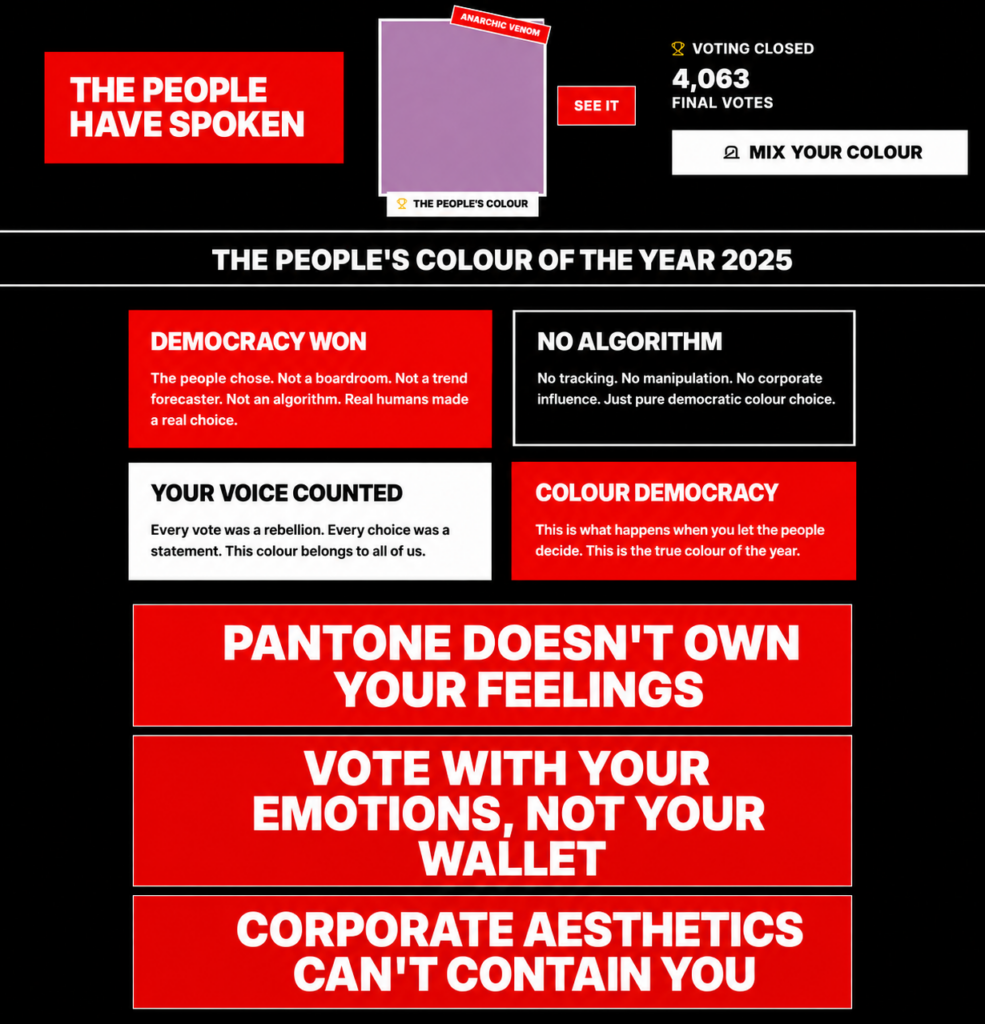
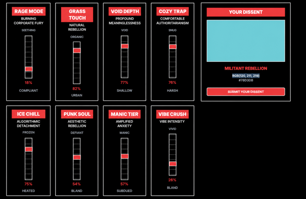
Figure 5a-b: Stuart Semple, "The Real Colour of the Year," a crowdsourced digital project (2025-ongoing).
To vote on a color, the website directs you to a new page titled "Emotion Color Mapper: Quantify Your Feelings into Corporate Approved Chromatic Data," which presents eight distinct affective criteria, each with two poles, between which you can toggle with a slider bar. The criteria are as follows:
- "Rage Mode: Burning Corporate Fury" (from "compliant" to "seething")
- "Grass Touch: Natural Rebellion" (from "urban" to "organic")
- "Void Depth: Profound Meaninglessness" (from "shallow" to "void")
- "Cozy Trap: Comfortable Authoritarianism" (from "harsh" to "snug")
- "Ice Chill: Algorithmic Detachment" (from "heated" to "frozen")
- "Punk Soul: Aesthetic Rebellion" (from "bland" to "defiant")
- "Manic Tier: Amplified Anxiety" (from "subdued" to "manic")
- "Vibe Crush: Vibe Intensity" (from "bland" to "vivid")
Manipulating these variables changes the voter's "dissent," displaying the RGB and HEX values for the relevant color (there are no Pantone codes in sight). Semple notes that there are "∞ colors possible." When I played around on the site, I got results like "Militant Rebellion" (a cyan blue; RGB 122, 211, 219) and "Radical Apocalypse" (a very pale, almost white gray, RGB 254, 247, 254). The winning color chosen by "the collective unconsciousness," however, was a lilac purple called "Anarchic Venom" (RGB 177, 125, 172).
Taken together, The Real Colour of the Year draws the user's attention to the numerical ontology of digital color, as well as how Pantone evacuates the COTY of meaning and imbues it with the vaguely soothing and taggable qualities of "vibes" or "aesthetics." In stark contrast to the pacified wellness of Pantone's COTY, these are not relaxing or pleasant feelings, but "ugly" ones describing sensations of frustration, numbness, and psychological unwellness.76Although the language evokes radical and leftist movements like anarchism, Marxism, punk, and disaffected youth culture in general, it also references their opposites: complacency, blandness, and right-wing authoritarianism. This decidedly more irreverent take on color's affective charge seems less about overt resistance (despite how earnestly Semple himself presents the project), and more about finding oneself at an impasse under digital capitalism, where feelings and actions are blocked or indefinitely suspended.
This ambivalence is reflected in the artwork's outcome and reception, whose impact was purely performative and hardly an actual threat to Pantone's dominance. Only 4,063 votes were cast over a six-month period, making Semple's claims that Anarchic Venom is "the true democratic expression of collective aesthetic preference, unfiltered by corporate influence or algorithmic manipulation" too willfully naïve to be entirely sincere. On social media, several people complained that they couldn't figure out how to vote, only learned about the project after the votes had already been tallied, or took issue with the premise all together. "What is your point in this? How is choosing your favorite color standing up to Pantone?" one user challenged Semple.77 Semple's takedown of Big Color, in all its comical futility, tells us something about what critical gestures are possible when any form of resistance is compromised from the get-go. When our embodied and affective experiences of color are tracked and privatized by corporate behemoths and repackaged as a superficial cure-all for what ails us, where do we go from here?
Feeling Colorful at the End of the World
As I've contended throughout this article, Pantone markets its COTY as a soothing balm for a precarious and unstable reality by taking advantage of color's much longer legacy as a mood modulator or catalyst of personal happiness. The language of ongoing crisis saturates present-day existence, where phrases like "state of emergency" and "unprecedented times" have become de rigueur, reflecting how mass media outlets and social media thrive on crisis and catastrophe's cyclical and seemingly unending nature.78 The lexicon of crisis easily gives way to the apocalyptic, to references to the end of days, the end of the world, the death of the planet. During the first two years of the COVID-19 pandemic, time became elastic, and what had been framed as a state of exception soon became "the new normal." When things were surely no longer business as usual, Pantone continued to churn out the COTY each December. Much like the way the news cycle paradoxically feeds on the very logic of disruption that threatens its temporal structure, the COTY relies on a steady stream of sociopolitical, technological, and ecological crises to frame color as a panacea, year after year. It elides the unevenness of how crisis is experienced — and who is most vulnerable to it — by constructing a romanticized vision of a common humanity.
The Pantone press releases immediately following the pandemic were markedly different from their predecessors in their direct acknowledgement of world events.79 2023's Viva-Magenta (18-1750) announcement explicitly mentioned the pandemic, the 2022 invasion of Ukraine, the economy, social unrest, supply chain breakdowns, and climate change, claiming that Viva Magenta "offer[ed] us the assurance and motivation we need to weather long-term disruptive events."80 Two years prior, 2021's Ultimate Gray (17-5104) and Illuminating (13-0647) promised that "everything [was] going to get brighter" after a year which saw the start of the COVID-19 pandemic, the continued rise of far right movements worldwide, the murder of George Floyd, and countless environmental disasters. Pairing "enduring Ultimate Gray with the vibrant yellow Illuminating," the press release states, "gives us resilience and hope. We need to feel encouraged and uplifted; this is essential to the human spirit."81
It would appear, however, that Pantone has stopped referencing current events, doubling down with wellness industry-adjacent language that is so deliberately apolitical it itself constitutes an opportunistic political choice ("Choosing rest and consciously stepping away from relentless demands and turning inward recognizes that true strength lies not just in doing, but also in being").82 Pitted against the longue durée of crisis, the Color of the Year is a visually pleasing Band-Aid that divorces color from politics in the name of universality by invoking an imaginary "us" and "we." Rather than draw attention to embedded inequalities or the need for structural change, it pacifies and placates. Color, here, becomes a key instrument of cruel optimism. It emblematizes the seductive, illusory promise of what comes after self plus a hyphen: self-care, self-preservation, self-expression, self-branding — all categories that have become compulsory aspects of existence in an era where the promise of "the good life" has eroded.83 The COTY might claim to represent a "blank slate" or a "fresh start," but it asks us to accept the status quo rather than taking action.84
Beginning in the late 2010s, I began noticing a proliferation of online parodies aping the format of Pantone's Color of the Year to sardonically reflect on a world in a perpetual state of emergency. These parodies echo Semple's work in their visual and formal strategies. However, the target of their ire is less Big Color per se as much as it is the political and ecological destruction of the planet itself, where the climate crisis is quite literally altering the colors of our environment, bleaching once vibrant coral reefs or staining the sky an aberrant orange hue. The Pantone color swatch, a cultural shorthand for the increasingly privatized experience of color in the twenty-first century, here becomes a template for critiquing — while laughing at — a company that markets their colors as an emotional reprieve from an increasingly unlivable world.
One of the first examples I found was in 2019, when Australian creative duo Jack + Huei created "PANTONE P 115-1 U Bleached Coral," a "subtly inoffensive hue" which "[represents] the fusion of modern life with the natural world, while straddling the fine line between hope and despair" (Figure 6a-b). The project was a response to Pantone's 2018 COTY, Living Coral (16-1546), whose announcement made no mention of climate change or reef bleaching, and was thus an instance of corporate "greenwashing."85 The pandemic provided a further impetus for similar Pantone parodies: in 2022, the Brooklyn-based cultural center Pioneer Works commissioned artists to choose their "Color of the Pandemic," resulting in playful selections like "Corrugated Cardboard" and "Telemedicine Teal" (Figure 7) and in 2023, graphic designer David Bieloh published "United Colors of the Apocalypse," an array of 130 dystopian photographic landscapes including "Gender Reveal Fire Yellow," "Pandemic Playground Pink," and "Try Not to Cough Mauve" (Figure 8).
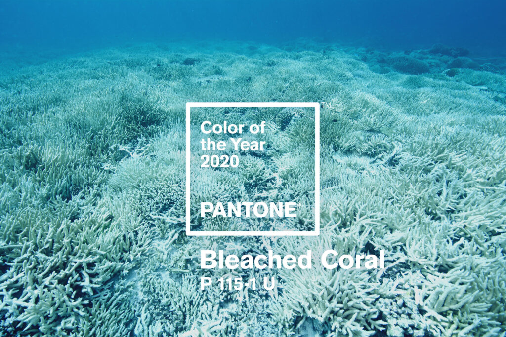
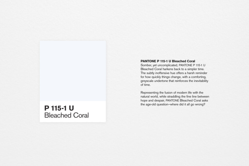
Figure 6a-b: Jack + Huei, "Color of the Year: Bleached Coral" (2022).
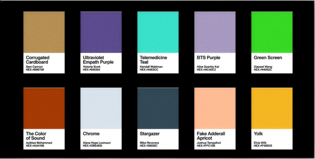
Figure 7: Page overview of "Color of the Pandemic," Pioneer Works Broadcast (2022).
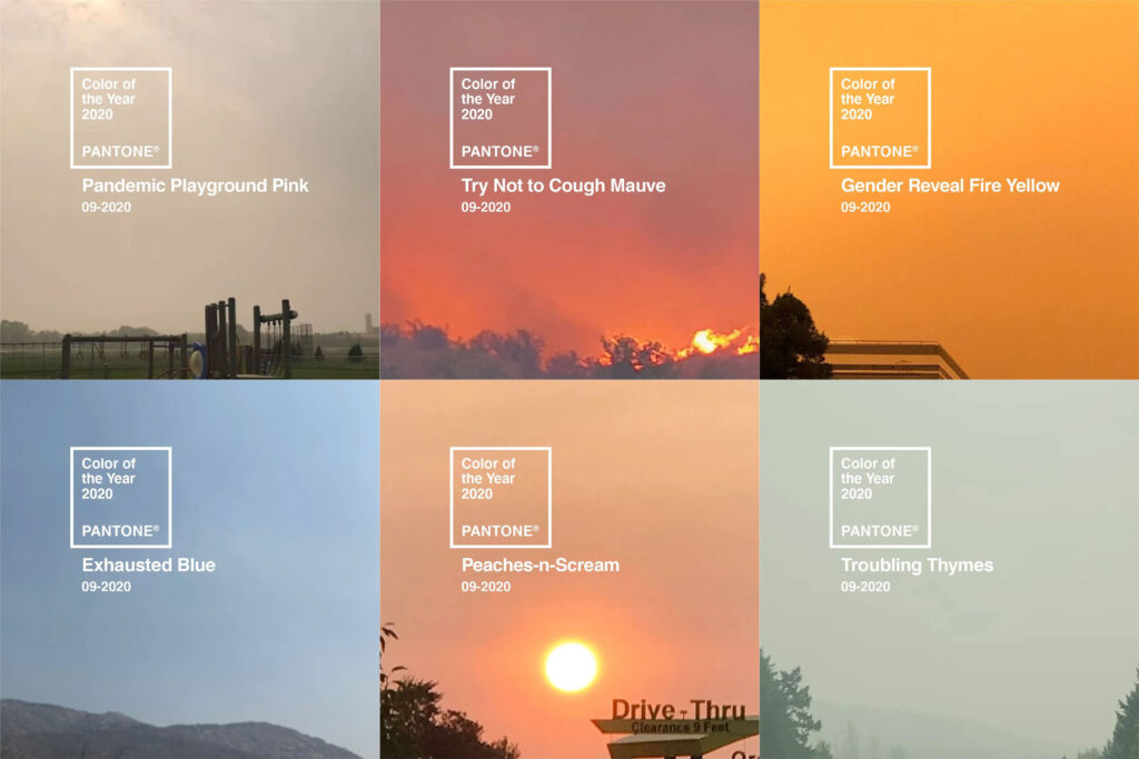
Figure 8: Selections from David Bieloh, "United Colors of the Apocalypse," American Prospect (2023).
These images use the COTY to call out the centrality of perpetual crisis and instability to the way many internet creators express themselves. But they also point to how historical changes in the commodification of color may also map onto changes in the very notions of irony and parody. This new aesthetic disposition exemplifies what Tung-Hui Hu has dubbed digital lethargy, a uniquely present-day affect characterized by emotional numbness and exhaustion from the constant pressure to "be yourself" in a world where every choice or action is converted into extractable data.86 Lethargy is a rejection — or at least a deferral — of the demands of liveness and agency expected of users on digital platforms. Like parasitical resistance, lethargy points to the ways in which critiques of digital capitalism are often more ambivalent and less action-seeking than those of earlier historical moments. The humor that these works employ is less a rollicking, feel-good kind of funny and more of a nod to survival and endurance within a broken system. Laughter, Hu notes, is one way of responding to imbalances in power, where online expressions like "LOL" and "haha" describe "not the full feeling of humor but rather the space or hesitation of it, the attempt to express something while not yet being ready to commit to a specific emotional end point."87 In a similar way, these projects that lampoon Pantone, with its saccharine language and effacement of the unevenness of care, invoke the parody genre without necessarily expecting us to really laugh.
Most parodies invoking privatized color to joke about the apocalypse are less polished and more haphazard than those I've mentioned so far, taking the form of memes circulating on platforms like Reddit, TikTok, and X, which are known for irreverent humor. Memes — which, as Laine Nooney and Laura Portwood-Stacer define, are "digital objects that riff on a given visual, textual, or auditory form and are then appropriated, re-coded, and slotted back into the internet infrastructures they came from"88 — allow users to defer the burden of selfhood by displacing it into nihilistic, "deadvoice" humor.89 For instance, on September 9th, 2020, when wildfire smoke turned the San Francisco Bay Area's skies a lurid and thoroughly "apocalyptic" shade of orange (a color which already routinely signifies a perpetual state of emergency), I was on a plane, watching out the window with horror and fascination as we descended into what looked like a fiery abyss [Figure 9a-b].90 Though I knew immediately that this chromatic aberration would result in a social media field day, what I didn't know was that on the ground, users were once again turning to Pantone.

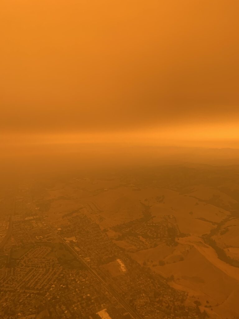
Figure 9a-b: Airplane view of the San Francisco Bay Area on September 9, 2020. Photos by the author. No photo editing has taken place.
Widely circulated were posts announcing the 2020 Color of the Year as 09-2020 "End of Days Orange" or "Climate Change" with images of the orange smoke-shrouded San Francisco skyline serving as the backdrop (Figure 10a). Another post shows a strip of Pantone color swatches in various shades of yellow and orange. An invisible hand, out of frame, holds the swatches up to a window, the orange sky clearly visible beyond the glass. The caption reads: "Trying to pick out the right shade of apocalypse for the baby's room" (Figure 10b).91 The bleak juxtaposition of the apocalypse with a gendered act of domestic comfort (choosing a color for the nursery) is, again, meant to evoke an "LOL" response, likely typed with an unsmiling, deadpan expression. There is nothing to clue us in as to whether the user actually has a baby, is painting a room, or has simply acquired the swatches "for the memes." The post belies nothing of the user's personal circumstances or true feelings, instead allowing them to "defer or set aside the burden of actualizing the online self" while the world is literally on fire.92
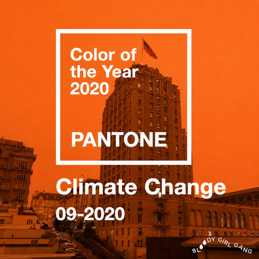
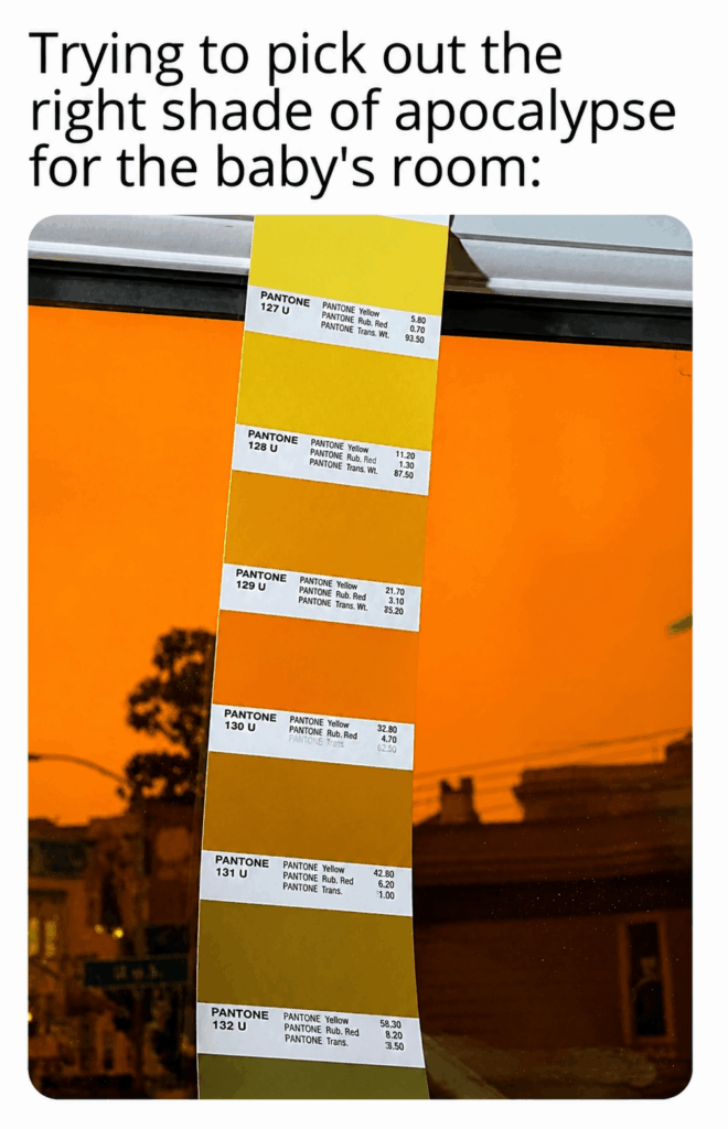
Figure 10a-b: Examples of satirical memes invoking Pantone's Color of the Year during the 2020 California wildfire season.
Conclusion
At first, the apocalyptic orange sky over the Bay Area seemed like a freak event. But the week of June 7th, 2023, when smoke from wildfires in Canada clogged up skies over the Eastern United States and colored the New York City skies the same impossible hue, it seemed all too possible that this might become the new normal. Once again, users attempted to capture the sky on their smartphones, posting to social media with a range of parodic references. I noticed that, in addition to parodies of Pantone, yet another pattern was emerging: users were highlighting the Hollywood convention of using overly warm color grading (sometimes called "the sepia stereotype") to situate the viewer in Middle East and/or Mexico without having to shoot on location, as seen in films like Traffic (2000) and TV series like Breaking Bad (2008-2013). Here, it's through the digital grading of landscape — not through people — that racial othering becomes visible, reminding us once again that color's longstanding entanglement with race extends far beyond skin tone.
"NYC has the orientalism filter on today," read a TikTok caption, referencing the Hollywood trope of using yellowish orange filters.93 "When New York gets covered in an orange haze and suddenly gets transported to Mexico," a similar meme on Reddit joked.94 So many analogous parodies circulated that the phenomenon made headlines and received its own entry on the database Know Your Meme.95 These posts, like "United Colors of the Apocalypse," find common ground in using lethargic humor and formal mimicry to critique an apolitical presentation of color that elevates aesthetic beauty and design above the precarity of living in crisis. The yellow filter with its associations of heat and pollution, points to the unequal distribution of environmental harm across the Global North and South. It also indicates how color as atmospheric aesthetic can be racialized through climate, as well as how the production and display of these vivid colors on digital screens is itself contingent on environmental harm.96
Thus, even as they are more passive and inconclusive than explicit calls to action or resistance, the parodies and artworks I've discussed in this essay ask us to see color differently. They make it apparent that color isn't something that can just be experienced, but is instead controlled and mediated by legal, political, technical, and corporate actors. They also highlight an ongoing historical tension: between the attempted quantification and rationalization of color on the one hand and its entanglement with subjective interior states like mood and personality on the other. In this way, they stand in stark contrast to Pantone, which hoards its chromatic monopoly through strategic data collection, algorithmic profiling, and an affect-driven marketing strategy based on "vibes." As the embodiment of Big Color, the Color of the Year is far more than a mere social media gimmick. It's the culmination of a much longer process of commodifying and privatizing sensory experience that may finally be hitting its limits.
Lida Zeitlin-Wu is an Assistant Professor in the Department of Film, Television, and Theatre at the University of Notre Dame. An interdisciplinary media scholar, her work explores the commodification and rationalization of sensory experience—especially color—under technocapitalism. She is co-editor of Color Protocols: Technologies of Racial Encoding in Chromatic Media (MIT Press, 2025) and a co-author of Technoskepticism: Between Possibility and Refusal (Stanford University Press, 2025). Her monograph, How Color Became a Technology: The Making of Chromatic Capitalism, is forthcoming from Duke University Press in May 2027.
Banner Image: Martin Howard on Flickr
References
I'd like to thank J.D. Connor, Aaron Obedkoff, Nia Judelson, and the two anonymous peer reviewers for their generous readership and in-depth feedback.
- Pantone, "Color of the Year 2026" (December 2025). [⤒]
- "Cheap Buzz- 40G Powder Paint Pigment- Not Peach Fuzz," Culture Hustle by Stewart Semple. [⤒]
- Vantablack is a high-tech coating developed by the U.K.-based aerospace and optical technology company NanoSystems previously dubbed "the blackest black" in existence due to its carbon nanotube structure, which absorbs up to 99.6 percent of incoming light (it was later surpassed by a material developed at MIT that absorbs 99.995% of light). Vantablack has never been made commercially available as a traditional pigment, in part because carbon nanotubes must be grown directly on a substrate in a tube that gets heated to 750 degrees Celsius (1,364 degrees Fahrenheit), extreme temperatures which would burn straight through most surfaces. For Kapoor to be able to safely use Vantablack in his work, Surrey NanoSystems created a custom artist-friendly version for him using special binders, making Kapoor the first—and only—in the world allowed to use the "blackest black" (albeit a modified version) for civilian purposes. See Adam Rogers, "Art Fight! The Pinkest Pink Versus the Blackest Black," Wired, June 22, 2017. [⤒]
- Stuart Semple, "Adobe & Pantone are banned from using my free colour palette,"YouTube, October 28, 2022. [⤒]
- Freetone is available for download here. [⤒]
- "BLACK 2.0 - The world's mattest, flattest, black art material by Stuart Semple," Culture Hustle by Stuart Semple. [⤒]
- Semple kept his language strategically vague for legal reasons, though as of July 2024, nobody from Pantone had contacted him to contest "Freetone." Sam Yellowhorse Kesler and Jeff Guo, "The Company That Owns Colors," Planet Money (NPR), July 19, 2024. [⤒]
- Pantone, "Pantone Color Systems Explained" (n.d.). [⤒]
- This is no coincidence: Munsell's organization of color into the perceptually uniform and discrete dimensions of hue, value, and chroma in a three-dimensional space proved particularly conducive to calibrating light-emitting screens. [⤒]
- Examples in the U.S. context, all founded at the turn of the twentieth century, would include the Optical Society of America, the US Department of Agriculture, and the Container Corporation of America. [⤒]
- Kirsty Sinclair Dootson, The Rainbow's Gravity: Colour, Materiality, and British Modernity (Yale University Press, 2023), 21-22. [⤒]
- Riverdale, Season 3, Episode 17, "The Raid" (The CW, 2019). Shortly after the episode aired, Pantone announced Flame Scarlet (18-1662) as one of twelve new shades in its Spring/Summer 2020 Fashion Trend Color Report, thus capitalizing on what was not actually product placement. [⤒]
- Anne Quito, "How Pantone Became a Global Authority on Color," The Atlantic, November 5, 2015. [⤒]
- Frank Pasquale, The Black Box Society: The Secret Algorithms that Control Money and Information (Harvard University Press, 2015). [⤒]
- Peter Galison, "The Ontology of the Enemy: Norbert Wiener and the Cybernetic Vision," Critical Inquiry 21 (1): 228-266. Galison writes that the black box was originally formulated in opposition to the transparent white box (a term rarely used today) which revealed its inner mechanisms to the user. [⤒]
- See Alexander Galloway, "Black Box, Black Bloc." Lecture, The New School, New York, April 12. [⤒]
- Pantone, "How the Color of the Year is Chosen" (2023). [⤒]
- See Robin James's forthcoming Good Vibes Only: Phenomenology and the Biopolitics of Algorithmic Legitimation (Duke University Press, 2026). James argues that vibes, unlike styles or genres, are directly linked to processes of algorithmic encoding. Recommendation algorithms categorize audiovisual content not by subject matter, but by similar "alignment" or "orientation" along data points that can be modeled mathematically—from Spotify's "Chill" playlists to the desaturated imagery of pale blogs on Tumblr I reference later in this piece. [⤒]
- I put "color studies" in scare quotes because it is less a cohesive subdiscipline (compared to something like sound studies) than a constellation of fields including art and design history, film and media studies, business history, the history of science, literary studies, philosophy, anthropology, and many others. [⤒]
- Carolyn L. Kane and Lida Zeitlin-Wu, eds. Color Protocols: Technologies of Racial Encoding in Chromatic Media (The MIT Press, 2025). A few key texts which deftly address color's racialized double valence across media forms include Dootson, The Rainbow's Gravity; Susan Murray, Bright Signals: A History of Color Television (Duke University Press, 2018); Nicholas Gaskill, Chromographia: American Literature and the Modernization of Color (University of Minnesota Press, 2018); Michael Rossi, The Republic of Color: Science, Perception and the Making of Modern America (The University of Chicago Press, 2019); and Joshua Yumibe, "On Vivid Colors and Afrotropes in African and Diasporic Cinemas," in Global Film Color: The Monopack Revolution at Midcentury, eds. Sarah Street and Joshua Yumibe (Rutgers University Press, 2024): 215-230. [⤒]
- Wendy Brown, Undoing the Demos: Neoliberalism's Stealth Revolution (Zone Books, 2015), 26. [⤒]
- Brown, Undoing the Demos, 29. [⤒]
- Brown, Undoing the Demos, 33. [⤒]
- Jonathan Crary, 24/7: Late Capitalism and the Ends of Sleep (Verso, 2013). [⤒]
- See Dylan Mulvin, "Media Prophylaxis: Night Modes and the Politics of Preventing Harm," Information & Culture 53, no. 2 (2018): 172-202, and Neta Alexander, Interface Frictions: How Digital Debility Reshapes Our Bodies (Duke University Press, 2025). [⤒]
- Meredith Hall, "Properties of Color: How Corporations Came to Own the Visible Spectrum," PhD diss. (The New School for Social Research, 2021). [⤒]
- Hall, "Properties of Color," 218. [⤒]
- Hall, "Properties of Color," 204. [⤒]
- John Cheney-Lippold, We Are Data: Algorithms and the Making of Our Digital Selves (New York University Press, 2017), 21. [⤒]
- Lida Zeitlin-Wu, "What's Your Color? Mood-Conditioning the Postwar Domestic Interior," Camera Obscura 38 3 (114): 35-75. [⤒]
- See, for example, Crary, 24/7, Nick Srnicek, Platform Capitalism (Polity Press, 2017), and Anna Kornbluh, Immediacy, or the Style of Too Late Capitalism (Verso, 2024). [⤒]
- Pantone, "Spot Color vs. Process Color Printing" (n.d.). [⤒]
- Joy Stempkowski, "Here's How Often You Should Be Replacing Your Pantone Guides," Pantone, July 15, 2025. [⤒]
- Kara Manke, "Scientists Trick the Eye into Seeing New Color 'Olo,'" UC Berkeley News, April 22, 2025. Of course, Semple was immediately on top of this development, responding with his usual cheeky antics and releasing a teal pigment called YOLO. [⤒]
- Lawrence Herbert with Linda Mead, The King of Color: The Story of Pantone and the Man Who Captured the Rainbow (Pantone, Inc., 2007). [⤒]
- Regina Lee Blaszczyk, The Color Revolution (The MIT Press, 2012). [⤒]
- Printed schedule for The Dynamics of Color, November 7, 1990, Cooper-Hewitt Museum, New York, NY. Held by Cooper Hewitt Research Library. [⤒]
- For example, see "How Brands Can Harness Pantone's Colour of the Year to Drive media Coverage," Press Loft, April 2, 2024. [⤒]
- See Brooke Erin Duffy, (Not) Getting Paid to Do What You Love: Gender, Social Media, and Aspirational Work (Yale University Press, 2017). [⤒]
- See Tung-Hui Hu, Digital Lethargy: Dispatches from an Age of Disconnection (The MIT Press, 2022). [⤒]
- @rosecfloristry, Twitter post, January 17, 2020. Since Twitter became X, the post has been taken down. [⤒]
- See Regina Lee Blaszczyk and Ben Wubs, The Fashion Forecasters: A Hidden History of Color and Trend Prediction (Bloomsbury, 2018). [⤒]
- Pantone, "Color of the Year 2026" (December 2025) and "Color of the Year 2025" (December 2024). [⤒]
- I discuss how Cloud Dancer flirts with white nationalist aesthetics in "Mama Don't Take My Chromophobia Away: Pantone's 2026 Color of the Year is Selling Us a White Fantasy," The Los Angeles Review of Books, February 4, 2026. [⤒]
- Pantone has largely avoided any racialized language or iconography since an ill-fated 2012 video promoting the SkinTone Guide in which an array of "diverse" people, including those coded as white, announced, "I am a person of color. . . . We are all people of color." As of 2025, the company frames the SkinTone Guide purely in terms of measurable skin pigmentation. [⤒]
- Mulvin, "Media Prophylaxis," 184. [⤒]
- Quoted in "Pantone's Color of the Year was Made for the Metaverse," The New York Times, December 2, 2022. The promotional material for the 2023 COTY, Viva-Magenta, was interpreted by the generative AI tool Midjourney to visualize "an endless new ecosystem to be explored, called 'the Magentaverse,'" a riff on the Metaverse. [⤒]
- Anna Kaufman, "Pantone Announces 2025 Color of the Year (No, It's Not Brat Green)," USA Today, December 5, 2024. [⤒]
- Laurie Ouellette, "Precarity Media: Zillow Scrolling and/as Social Insecurity" (paper presented at the Society for Cinema and Media Studies, Chicago, IL, April 4, 2025). [⤒]
- Kirsi Goldynia, "Pantone chooses a classic for its 2020 Color of the Year," CNN, December 4, 2019. [⤒]
- Leatrice Eiseman, "Reflections of a Decade in Pantone Color," personal blog, December 10, 2010. [⤒]
- On the history of anxieties surrounding blue light exposure, see Mulvin, "Media Prophylaxis." [⤒]
- Tom Vanderbilt, "Sneaking into Pantone HQ," Slate, April 27, 2012. [⤒]
- Vanderbilt, "Sneaking into Pantone HQ" [⤒]
- See Minh-Ha T. Pham, Why We Can't Have Nice Things: Social Media's Influence on Fashion, Ethics, and Property (Duke University Press, 2022). [⤒]
- Laurie Pressman, quoted in Pantone, "How Color of the Year is Chosen" (c. 2023). [⤒]
- "Pantone Color of the Year 2016: Pantone 13-1520 TCX Rose Quartz and Pantone 15-3919 TCX Serenity." Official press release, December 2015. [⤒]
- On Millennial Pink's significance within pink's cultural and aesthetic legacy, see Valerie Steele, Pink: The History of a Punk, Pretty, Powerful Color (Thames & Hudson, 2018). [⤒]
- Christine Goding-Doty, "Beyond the Pale Blog: Tumblr Pink and the Aesthetics of White Anxiety," in A Tumblr Book: Platform and Cultures, eds. Allison McCracken, et al. (University of Michigan Press, 2020): 344-355. [⤒]
- Sianne Ngai, Theory of the Gimmick: Aesthetic Judgment and Capitalist Form (Harvard University Press, 2022), 68. [⤒]
- Ngai, Theory of the Gimmick, 68. [⤒]
- "Pantone's Color of the Year was Made for the Metaverse" [⤒]
- BlueLu, "Sad Beige Won: 2025 Pantone Color of the Year, Mocha Mousse," r/craftsnark, Reddit, December 2024. [⤒]
- Ngai, Theory of the Gimmick, 9. [⤒]
- Ngai, Theory of the Gimmick, 135. [⤒]
- Ngai, Theory of the Gimmick, 59. [⤒]
- Anna Watkins Fisher, The Play in the System: The Art of Parasitical Resistance (Duke University Press, 2020), 32. [⤒]
- Fisher, The Play in the System, 5-6. [⤒]
- Stuart Semple, "Legal costs- help me fight for Kleinish Blue," GoFundMe, April 29, 2025. By June 2025, Semple had only raised €10,278 (the Yves Klein estate had sued him for €16,000 in damages). As one last hurrah, he attempted to raise additional legal fees by producing a limited-run of posters reading FCUK
KLEINin Kleinish Blue ink accompanied by "certificates of illegality." [⤒] - Fisher, The Play in the System, 21. [⤒]
- Sarah Cascone, "Why Another Artist Just Renamed Himself Anish Kapoor," Artnet, October 31, 2024. [⤒]
- Fisher, The Play in the System, 11. [⤒]
- Stuart Semple, "Take the colour back - I've had enough of a secret cabal of colour capitalists dictating the colour of the year every year." Instagram, September 12, 2025. The post has since been taken down. [⤒]
- As coined by Shoshannah Zuboff, surveillance capitalism describes the now-ubiquitous profit-driven model where corporations like Google collect and monitor consumer data, often without consent. See Zuboff, Surveillance Capitalism (Profile Books, 2018). [⤒]
- Stuart Semple, "The Real Colour of the Year" (c. 2025). Accessed July 18, 2025. [⤒]
- Ngai, Ugly Feelings (Harvard University Press, 2007). [⤒]
- Stuart Semple, "Okay so I've made a thing. You know how I'm fed up of Pantone dictating the colour..." Facebook, July 18, 2025. [⤒]
- Mary Ann Doane, "Information, Crisis, Catastrophe," in New Media, Old Media: A History and Theory Reader, eds. Wendy Hui Kyong Chun and Thomas Keenan (Routledge, 2006): 252-265, and Wendy Hui Kyong Chun, "Crisis, Crisis, Crisis: On Sovereignty and Networks," Theory, Culture & Society 28, no. 6 (2011): 91-112.[⤒]
- One notable exception is 2002's True Red (19-1664), released after 9/11. [⤒]
- "Viva-Magenta: Pantone's Color of the Year 2023," Press Release, December 2022. [⤒]
- "Pantone Releases Color of the Year 2021: PANTONE® 17-5104 Ultimate Gray and PANTONE 13-0647 Illuminating," Press release, December 9, 2020. [⤒]
- Pantone, "Color of the Year 2026." [⤒]
- Lauren Berlant, Cruel Optimism (Duke University Press, 2011). [⤒]
- Pantone, "Color of the Year 2026." [⤒]
- A company engaged in greenwashing makes itself out to be more environmentally conscious than it is, often through visual signifiers like ecological imagery and shades of green (color forecasting, which accelerates the demand for ever-changing products, is a notoriously wasteful enterprise). [⤒]
- Hu, Digital Lethargy, viii. [⤒]
- Hu, Digital Lethargy, 86. [⤒]
- Laine Nooney and Laura Portwood-Stacer, "One Does Not Simply: An Introduction to the Special Issue on Internet Memes," Journal of Visual Culture 13, no. 3 (December 2014): 249. [⤒]
- Hu, Digital Lethargy, 86. [⤒]
- See Anna Watkins Fisher's brief but incisive Safety Orange (University of Minnesota Press, 2021), which reveals the centrality of the color standard known as Safety Orange to neoliberal assessments of risk. [⤒]
- In a twist, many of these photos had to be edited to convey the "correct" color. Users experienced frustration that the photos taken on their smartphones were automatically white balancing the image, resulting in a less vibrant orange than what they were really seeing. The hue was so seemingly unnatural that it stretched the limitations of pre-calibrated color. [⤒]
- Hu, Digital Lethargy, 86. [⤒]
- @hotboyshaif, "NYC Has the Orientalism Filter on Today," TikTok, June 6, 2023. [⤒]
- @johnlen1n, "Who turned on the filter?" Reddit, June 2023. [⤒]
- See Kiko Martinez, "The Internet Thinks NYC Looks Like it Has 'Mexico Filter'—We Explain," REMEZLA, June 8, 2023; "2023 Canada Wildfires," Know Your Meme. [⤒]
- Siobhan Angus's work discusses how screen color relies on rare Earth minerals. See Camera Geologica: An Elemental History of Photography (Duke University Press, 2025). [⤒]
Related reading
 The Slow Burn: My Struggle
 Manifest Diversity and the Empire of Finance
Susan Sontag and the Americanization of the Nouveau Roman
Manifest Diversity and the Empire of Finance
Susan Sontag and the Americanization of the Nouveau Roman
 The Programming Era: The Art of Conversation Design from ELIZA to Alexa
“The Trouble Spot”: Racialized Paranoia and the Vision of the State in The Spook Who Sat by the Door
Cartoon Viscera
The Programming Era: The Art of Conversation Design from ELIZA to Alexa
“The Trouble Spot”: Racialized Paranoia and the Vision of the State in The Spook Who Sat by the Door
Cartoon Viscera
 Toward a Trans Fag Phenomenology: the Orientation(s) of Desire and the Afterlives of Lou Sullivan
Seeing Past Consumption: Race and Species in the Slaughterhouse
The Blues Brothers, Tammy Wynette, and the Long Denouement of the 1960s
Toward a Trans Fag Phenomenology: the Orientation(s) of Desire and the Afterlives of Lou Sullivan
Seeing Past Consumption: Race and Species in the Slaughterhouse
The Blues Brothers, Tammy Wynette, and the Long Denouement of the 1960s
 Side Hustle: College Sports and the Future of Academic Labor
Toward a Poetics of the Detainee
Side Hustle: College Sports and the Future of Academic Labor
Toward a Poetics of the Detainee